Funniest album covers from 2013
- Dec 31, 2013
- 2 min read
Now it’s time to take sh*t seriously – or not! Sometimes you just fail. It might be because of the client and their weird visions, a bad (hair) day or just lack of your talent. My message to all bands and musicians out there is remember to respect the designers and their profession. If you are an educated and experienced designer you can have you word, otherwise let us do our work or you might get into lists like this faster than you can say ‘can I have some 3D and lens flare with Abaddon font‘. Don’t get me wrong, designers really need to listen to their client but it goes vice versa.
Many of these album covers are not horrible or bad, they are meant to amuse and it’s great! Some of these are trying a bit too hard and some are just result of lazy design. I’ve listened most of these albums and they have some amazing songs in them. It’s a shame they don’t have the album art deserved.
Anyway, have fun and remember not take things too seriously!

The 90’s 3D rendering period should be over now…

What are my eyes seeing? Oh it burns!

Looks legit to me! Respect to Cannibal Corpse. Love this!


Deep Purple, now what have you done?! I mean ‘Chiller’ font?! Otherwise such a great album.

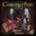
It took me a long time to figure out a) name of the band b) title of the album.

‘Boogie all night long…’

The only thing this one missing is Algerian-font. No wait…


This is actually really good album, one of the best ones 2013. I still don’t understand the Angry Birds reference here…

This one is really cool, cheesy but cool!

If you need some help with Photoshop, go to www.photoshoprequest.com. They do it for FREE!

Google this cover and you get some disturbing mock-ups.

Just for the love of cheesiness.


If only this one was a b-movie from 80´s. This is awesome!


There is always at least one cover screaming for ‘Goatse’ in my annual lists…

I think it’s time to stop using Abaddon font, eventhough this one treats it with respect.


I love this!


Uuuhh… so hot!
