A New Brand Identity, Website and Event Materials for Mäikä Klubi
- 1 day ago
- 3 min read
Mäikä Club is stepping into a new era with a completely renewed visual identity, website and event marketing package. Bandmill designed the club’s new logo, brand identity, WordPress website and a wide range of promotional materials for its first event on September 26, 2026.
Mäikä Club wanted to start with a clean slate. The old visual direction was left behind, and the goal was to build something sharper, bolder and more recognizable for the club’s new phase.
The project began with a review of Mäikä Club’s previous materials and visual background. Instead of simply updating what already existed, the idea was to create a fresh identity that would feel like a genuine new beginning. Naturally, the logo became one of the key elements of the project.

After the initial design phase, I created several different logo variations for Mäikä Club. These options were reviewed and discussed with the client, and after further development the final direction became clear: a sharp, angular and distinctive logo that breaks away completely from the old look. The new logo gives Mäikä Club its own visual voice. It is edgy, intense and slightly threatening in exactly the right way. In other words, it does not politely ask for permission to exist.
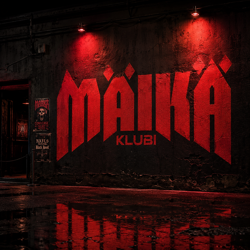
Alongside the logo, I developed a new brand identity built around a frightening shade of red as the main colour. However, the identity was also designed to allow colour variation between different events. This gives each event its own visual tone while keeping everything connected to the overall Mäikä Club brand.
For typography, the main typeface chosen for Mäikä Club was Bricolage Grotesque, a stylish and versatile sans serif font. It was paired with New Rocker, a sharper and more characterful supporting font that brings the right amount of roughness, attitude and underground energy to the identity. Together they form an excellent duo: one keeps the design controlled, while the other kicks it in the shins just enough.

The new identity was put to use immediately, as Mäikä Club already had its first event coming up. For the event on September 26, 2026, I designed poster materials, social media graphics, a flyer and several videos. The event features Enemies Everywhere, Shaken and Aberrations. One of the videos was also created as a digital advertisement, displayed in a highly visible location in the centre of Hyvinkää.


In addition to the visual identity, I also designed and built a completely new website for Mäikä Club at maikaklubi.fi. The website was created from start to finish with WordPress, and its purpose was to act as the digital home of the new brand identity as well as the official starting point for Mäikä Club’s activities. The site was built using the WordPress Gutenberg editor with the free version of the Kadence theme. This provided a solid, functional and visually consistent foundation for the club’s online presence.
The website also includes an integration for event ticket sales through Livet, allowing visitors to move smoothly from event information to purchasing tickets. Mäikä Club’s Facebook page was also updated to match the new identity, ensuring that the brand feels consistent across both the website and social media.
Bandmill was responsible not only for the visual design, but also for the written content. I wrote and produced the copy for both the website and the first event’s marketing materials. This helped create a unified whole where the logo, colours, typography, website, advertising materials and event communication all speak the same language.
The Mäikä Club project is a good example of a brand identity that does not simply remain as a logo file hidden away in a folder. It was immediately brought into real use across the website, social media, print materials, event advertising and motion content. The result is a strong visual starting point for Mäikä Club and a flexible foundation for future events.
Comments